Bold text on LinkedIn: where it works and where it doesn't
Can you use bold text on LinkedIn? In articles, yes, with a built-in button. The post composer has no bold option at all.

Short answer: you can use bold text on LinkedIn in articles, which have built-in bold and italic formatting, but the regular post composer has no bold option. The catch: the bold-looking words you see in some feed posts are special Unicode characters pasted in from outside LinkedIn, not real formatting, so they don't behave like ordinary text.
Below: how to bold text in an article, what the post composer does offer, and when bold-looking characters are worth the trade-off.
Why you can't find a bold button in LinkedIn posts
A lot of people assume there's a hidden shortcut for bold in LinkedIn posts. They've seen bold words in their feed, so the option must be somewhere.
It isn't. LinkedIn's help page on sharing updates lists the tools in the post composer, and text formatting isn't one of them.
The bold you've seen in posts was created somewhere else and pasted in. It looks like formatting, but LinkedIn never applied it.
That's the key distinction for everything that follows.
Articles have real formatting. Posts have none, and anything bold in a post is a workaround.
What the LinkedIn post composer does offer
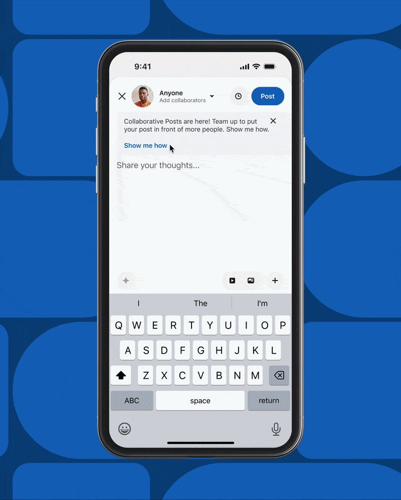
The post composer is built for quick updates, and its tools reflect that. LinkedIn lists:
- Emoji, to add emoji to your text.
- Add media, for photos and videos.
- Event and celebration options, including a calendar icon and Celebrate.
- A Plus menu, for sharing that you're hiring, creating a poll, adding a document or finding an expert.
- A clock icon, to schedule the post.
None of these changes how your words look. The text itself stays plain: same font, same weight, same size.
If you need headings, lists or emphasis, LinkedIn's answer is its article tool, covered next.
How to use bold text in a LinkedIn article
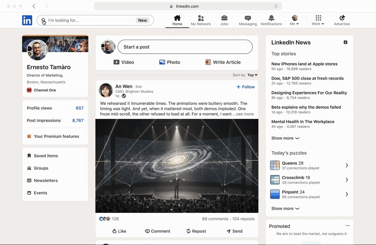
Articles are where native bold lives. LinkedIn's page on writing and publishing articles says you can bold or italicize any text in the editor.
- Click Write article in the share box at the top of your homepage.
- Write or paste your text into the editor.
- Highlight the words you want to emphasize.
- Apply bold from the editor's formatting options.
The same selection works for italics.
Bold in an article is real formatting, so the words stay ordinary text underneath.
This only works on a computer. LinkedIn says the article feature isn't available in the LinkedIn mobile app.
Other formatting you get in articles
Bold is only one of the article editor's tools. LinkedIn says you can:
- Change the text style, for headings and body text.
- Bold or italicize any text.
- Add ordered or unordered lists.
- Add blockquotes.
- Add a divider between sections.
The editor also has buttons for Media, Link, Code and Embed, so you can bring in images, links, code snippets and embedded content.
That's a full writing toolkit. If your piece needs structure, such as headings, lists and emphasis, an article is the tool LinkedIn built for it.
Articles are a desktop-only tool
This catches people who do most of their LinkedIn activity on a phone.
LinkedIn's help page is explicit: the article feature isn't available on the LinkedIn mobile app. You'll need a computer to write, format and publish one.
Plan around that. The limit is on creating articles in the app, so set aside desktop time for the writing and formatting.
If you draft ideas on your phone, keep them in a notes app and move to a computer to build the article. Formatting on a big screen is easier anyway.
Where the bold text in feed posts comes from
When you see bold words in a regular LinkedIn post, the writer used Unicode lookalike characters.
Unicode includes sets of mathematical and stylized letters that happen to look like bold, italic or other type styles. Third-party text converters take ordinary words and swap each letter for its lookalike. People then paste the result into the LinkedIn composer.
To the eye, it's bold. To software, each character is a symbol, not the normal letter it resembles.
LinkedIn doesn't provide or document this method. It's something members do on their own, using tools outside LinkedIn.
The downsides of Unicode bold in posts
Because the characters aren't normal letters, they can cause problems that plain text doesn't:
- Searching may miss them. Software looking for the word "growth" may not match the lookalike version.
- Assistive technology may struggle. A tool that reads text aloud may read out symbol names or skip the words, depending on how it handles those characters.
- Editing is awkward. You can't un-bold a word in the composer; you have to retype it.
- Display can vary. Some devices or fonts may not show every lookalike character the same way.
Those are the practical reasons many writers avoid the workaround, or keep it to a word or two.
If you use bold characters anyway, keep it sparing
Some people decide the visual emphasis is worth it. If you're one of them, a few habits limit the damage:
- Bold a short phrase, not a sentence. One or two words carry the emphasis.
- Never bold key terms people might search for, such as your job title or a skill.
- Keep names, links and hashtags in plain text.
Read the post on your phone before publishing. If the lookalike characters render oddly there, others will see the same.
Used heavily, stylized text can make a post look like an advert. Used once, it can point the eye to the line that matters.
Formatting a LinkedIn post without bold
You can make a post easy to read without any special characters. Plain-text structure does most of the work bold is meant to do:
- A strong first line, so the key point is visible before anything else.
- Short paragraphs, separated by blank lines.
- Numbered points typed as plain text, like 1., 2., 3.
- Emoji used sparingly as markers, through the composer's own Emoji tool.
Clear structure usually beats typographic tricks. Readers skim the feed, and white space guides their eye more reliably than a bold word does.
When a post should become an article
If you're reaching for bold, headings and lists, you may have outgrown the post format.
Posts have a 3,000-character limit. LinkedIn's own advice is that if your post exceeds 3,000 characters, you can instead write an article using its publishing platform.
Articles give you the formatting you were trying to fake, plus room to develop an idea properly. If you're weighing the switch, it's worth reading up on writing and publishing LinkedIn articles before you start.
A useful rule: a post makes one point quickly. An article makes a case, and a formatted article reads far better than a long post full of workarounds.
Article settings to check before you publish
Once you've formatted your article, a few settings are worth a look. LinkedIn puts them under Manage, then Settings:
- Article URL, the web address of the article.
- SEO title, the title search engines may show.
- SEO description, the short summary that goes with it.
You can also schedule the article with the clock icon instead of publishing immediately.
If you mention someone with "@", LinkedIn notifies that member or Page. Use mentions for people who genuinely contributed, not to reach a wider audience.
Where your articles appear on your profile
Published articles show up in the Activity section of your LinkedIn profile, alongside your posts and other activity.
That makes them part of how people see your work. A visitor browsing your activity sees your formatted articles next to your shorter updates.
It's another reason to use native formatting there. A well-structured article with clear headings and occasional bold reads like a finished piece of writing.
If you publish articles regularly, they build a record of your thinking that a feed post, which scrolls away quickly, doesn't.
The accessibility step LinkedIn does support
If you care about accessibility, LinkedIn's help pages point to one tool: alt text for images. The page on adding alternative text explains it.
On desktop, after you upload an image, click Alt. text below it, write your description and click Save. On mobile, tap ALT, write the description and tap Done.
LinkedIn says it may automatically add alt text to images that don't have it. Writing your own is still better, because you know what the image is meant to show.
Plain text and good alt text together make a post easy for everyone to read.
Does bold text help a LinkedIn post perform?
LinkedIn doesn't document any effect of text formatting on how posts are distributed. There's no official signal that bold characters help or hurt reach.
What formatting can change is how people read. A reader who can spot the main point quickly is more likely to keep going.
You can get that effect without special characters. A clear first line, short paragraphs and white space do the same job, and they don't carry the downsides of lookalike text.
Judge any format by one test: does it make the post easier to read? If yes, keep it. If it just decorates, cut it.
Bold on LinkedIn: your choice
Real bold text on LinkedIn lives in articles, on desktop, with a single click. Feed posts have no bold option, and the bold you see there is Unicode lookalike text pasted in from elsewhere.
Using those characters is your call. Plenty of writers use one bold phrase and are happy with it. Plenty of others keep posts plain and let structure do the work.
Pick the approach that fits the piece. For your next long piece, open Write article and try the native bold first.
Formatting questions
Can I italicize text in a LinkedIn post?
Not with a built-in option. The post composer lists no text formatting tools, while articles let you bold or italicize any text.
Can I write a formatted article in the LinkedIn mobile app?
No. LinkedIn says the article feature isn't available in the mobile app, so you'll need a computer.
Is there a keyboard shortcut for bold in LinkedIn posts?
LinkedIn's help pages don't list one, and the post composer shows no text formatting tools.